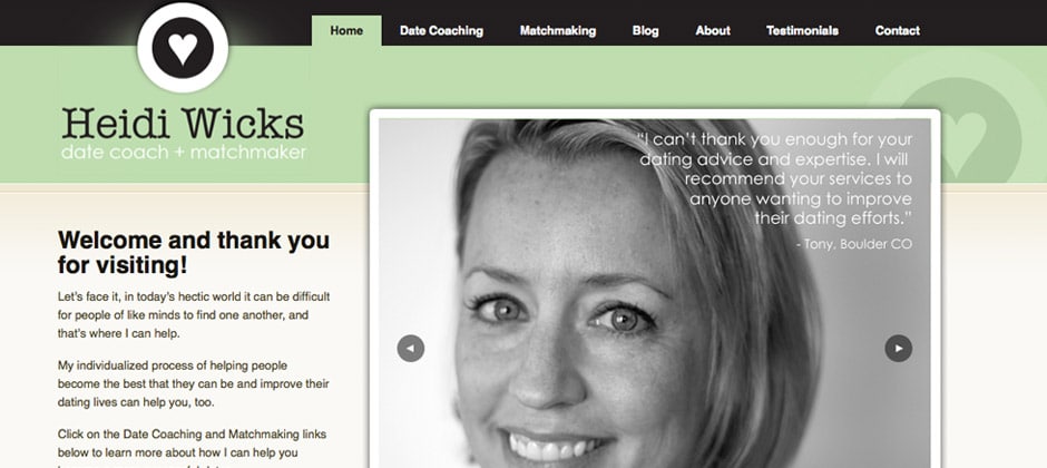
The HeidiWicks.com website was designed to clearly communicate Heidi’s personalized approach to Date Coaching and Matching, while incorporating her existing logo and branding colors throughout the site. This is a WordPress driven site, with a high level of customization to drive page functionality, as well as a customized WordPress theme, custom page templates, and a remodeled WordPress admin to make managing the content very easy for Heidi into the future. Custom content types were created within WordPress to handle templating and style formatting for client testimonials, news announcements, blog posts, and page content updates.
In addition to the WordPress customization, we integrated the contact form on the site with Heidi’s existing SalesForce.com account, so that all lead generation through her website is automatically synced with Sales Force, and she can more easily manage her clients and new leads going forward. We also migrated her existing Blogger blog posts into the new site structure and dating blog, which can all be maintained from the Admin panel and CMS that Heidi now uses to manage all her site content.
We kicked off this project with an informal meeting in Boulder over coffee, where Heidi described her hopes and requirements for the new site, as well as her existing online content that she wanted to incorporate into this new site. We presented several site design variations to help guide the conversation and make decisions about overall layout, look and feel, as well as high level site functionality and color choices. Once we collectively narrowed those options down to a clear winner for the site design, we were able to move forward and setup her site hosting and configure her existing DNS entries to point at the new domain. At that point in the process, we launched a great looking landing page for the new domain with the Heidi Wicks date coaching logo, and some textual information about when the new site would be launching with a countdown timer.
The only page visible to the general public and search engines at this point in the process is that front landing page, but behind the scenes we were able to fully develop the new site, and create login access for Heidi and other project stakeholders so they were able to review the site development and offer feedback at various stages to ensure the project was on track and progressing daily. After several rounds of feedback, site review, and site testing in various browsers (IE6, IE7, IE8, Firefox, Safari, Google Chrome, etc), operating systems (Windows/Mac), and mobile devices like Blackberries, iPhones, iPads, and Android phones, Heidi was ready to launch hew new website, and we were confident that it would look great no matter what device or computer OS people were using to visit it! All that was left to do was take down the placeholder landing page, and the site was open and ready for visitors, search engine indexing, and potential clients to find Heidi online!