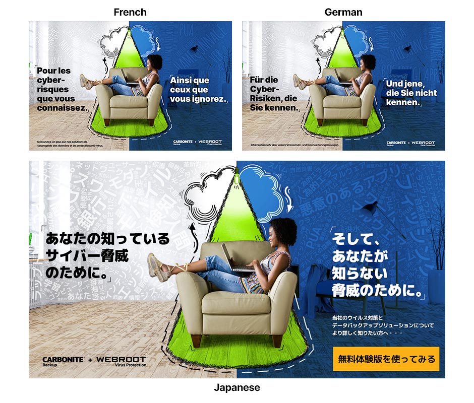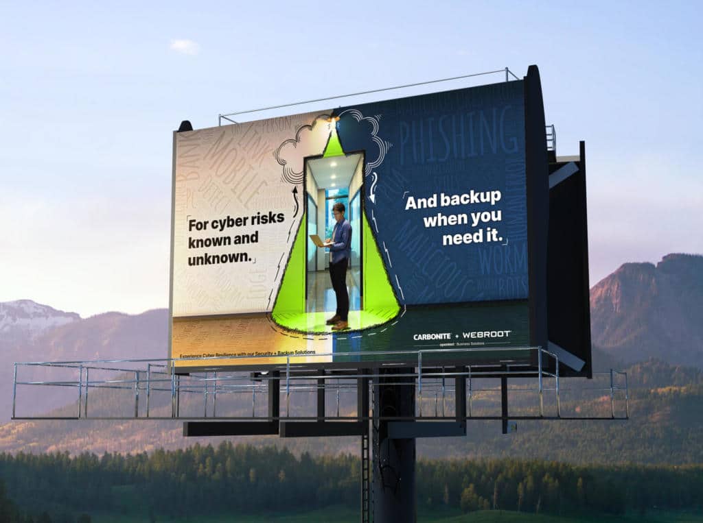
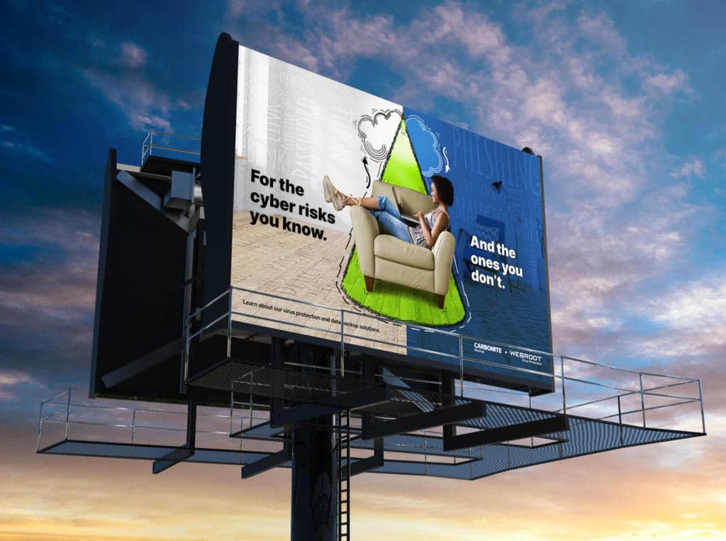
This global marketing campaign ad creative was designed and implemented for Carbonite + Webroot across North America and EMEA markets in English, French, German, and Japanese languages. The high-level concept for this marketing campaign was “Magnifying Light”, and the final ad campaign designs bring this to life by amplifying what’s lurking in the dark or just beyond the periphery. These designs quickly convey the “why we do what we do” for the client, and reveals the mechanism by which customers are continually protected from cyber threats. With a family of ways to illustrate this, this concept is flexible to many type of media while implying that the protection is always on, even when the end user is not.
Global Ad Campaign Messaging
Consumer and Business audiences have different expectations and mindsets when interacting with marketing campaigns, and our task was to create a unified design concept that could be tweaked to fit both audiences while remaining recognizable and unique. By making slight adjustments to the messaging and imagery between the consumer and business ad creative, we were able to achieve a slightly more casual approach for the consumer segment, while bringing a more technical mindset for the business audience. This was done through both messaging and design elements in the ad creative.

Ad Design Creative Elements
Physically placing the personas within the “cone of light” creates an immediate connection with being protected, and the chaotic and random “word cloud” elements only appear outside of this safe area in the designs. Additionally, these ad campaign designs split those “word clouds” apart to connect directly with the campaign messaging, with more common risks on the left, and more ominous threat words on the right side. For the consumer audience, we selected a more informal/casual image of a home user with known threats in front, and unknown threats behind her.

Subtle hand drawn elements were used throughout the campaign ads to accentuate the titles and text treatments, and reinforce the concept “protection” of the users around the cone of light. This helped bridge the gap between highly technical, and having these designs remain personal and approachable. Both designs for consumer and business audiences also feature an element of depth, dimension, and perspective within the space created in these designs.
Display Banner Ad Creative
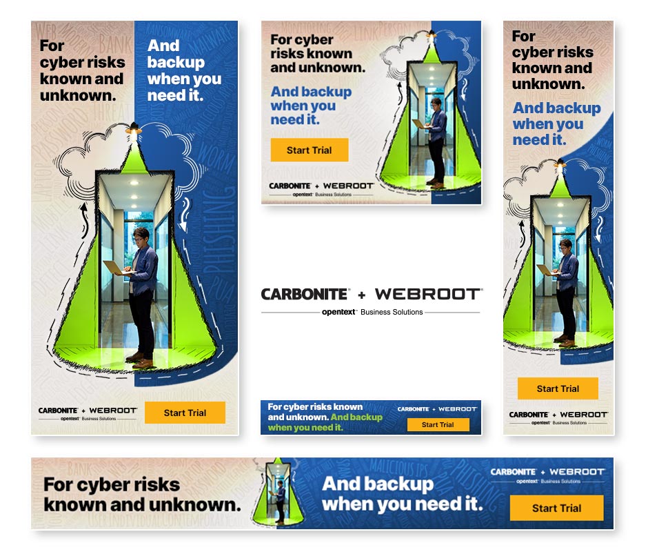
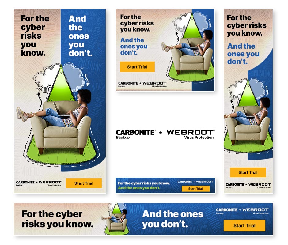
For the display ad creative for this campaign, we created 5 static display ad sizes as well as matching animated HTML5 ads across the four languages. The call-to-action for the campaign was “Start Trial”, which would take users to a matching campaign landing page where they are able to sign up for free product trials. These ads were used across many channels for both prospecting and remarketing audiences with complex segmenting and analytics for later data reporting for the client. Animated ads featured a “pulsing” effect from the light, as well as kinetic text animations, and movement of the arrows within the cloud graphic.
Global Campaign Ad Design Translations
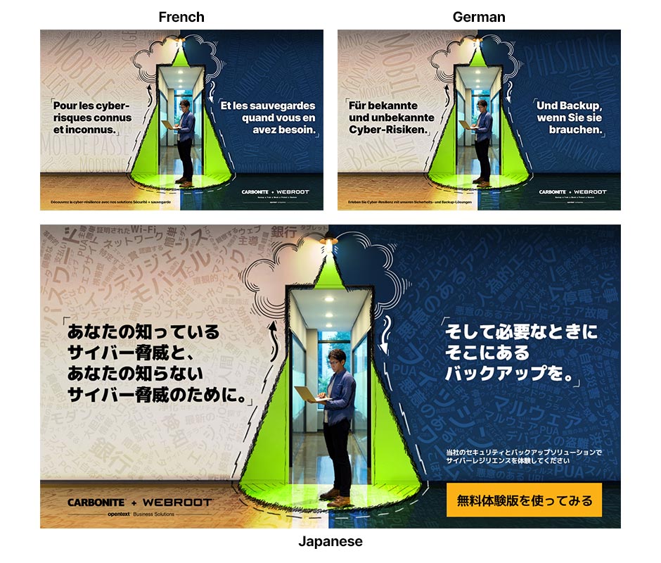
The global campaign ad creative was translated into multiple languages for international audiences, including French, German, and Japanese in addition to the English ad set. Not only were the headlines translated, but the word cloud texture in the background was also translated and edited to fit around the elements of each design layout. This amounted to hundreds of ads that were output
