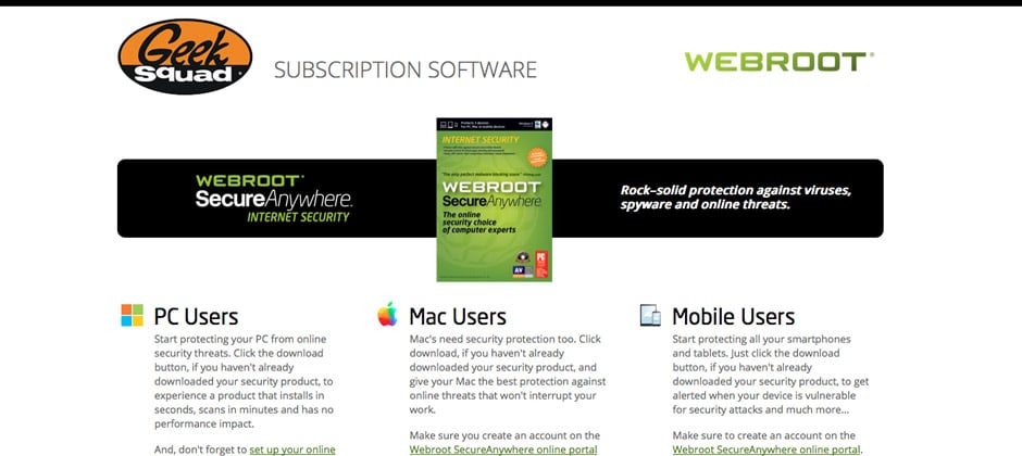
This microsite web design project had strict requirements to match existing brand guidelines established by Geek Squad, and to create a consistent experience for microsite website visitors and allow quick and easy access to software downloads, FAQ’s, installation guides, contact information, and live on-page Chat capability within the microsite. We began this process by doing an informal audit of Geek Squad’s website design, and other assets we were delivered at the start of the project, to determine the best elements to incorporate into this microsite web design project.
Microsite Web Design Elements
The primary goal of this microsite web design project was to allow for quick access to downloads and installation guides for PC, Mac, and Mobile users of the product, and match existing web design elements for the Geek Squad. The homepage of this microsite web design project features the Geek Squad logo prominently in the upper left, followed by the product offer. The colors used in the microsite design exactly match the Geek Squad brand colors, feature high-contrast font and callout box colors, as well as orange buttons and link colors over the callout boxes. A grid-based columnar layout was used to keep the content organized, and the high-contrast primary and secondary buttons throughout this microsite web design should help to improve conversion on these web site pages.
The large photo headers over the block navigational elements within the microsite web design make finding and clicking through to other microsite pages very easy and intuitive for website visitors. The navigation photos were also treated in black & white to further enhance the visibility of the orange buttons in the web page.
Internal pages on the microsite web design carried over these same graphic design styles, but used more horizontal layouts to organize content on the page. The photo elements were also carried over, which will help visitors stay oriented on the microsite web design internal pages and allow them to find what they are looking as quickly as possible. Contact information was also a very important aspect within this microsite web design project that needed to be prominent and easy to find for site visitors.

