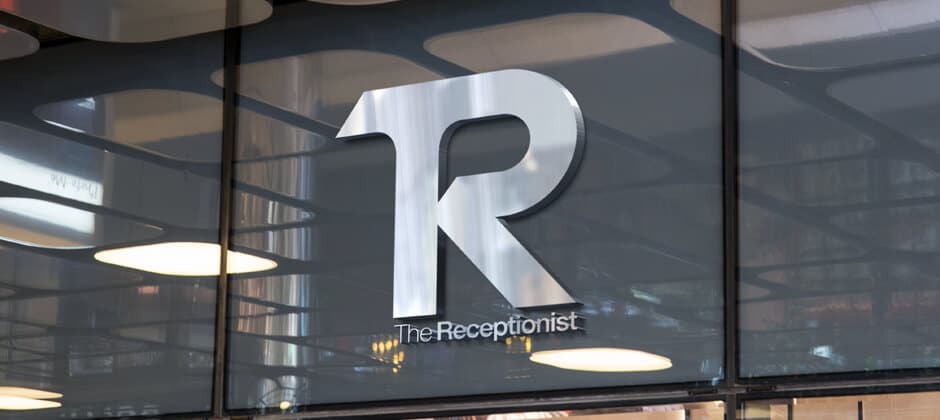
The Receptionist for iPad is a Denver-based company that uses Cloudburst as a one-stop-shop to design their marketing materials, creative assets, and web site design and admin management. The project kicked off with logo design, branding updates, and general marketing materials, and was quickly followed by website design and development to revamp the entire look and feel of the corporate materials and experience.
Logo Design & Corporate Branding
A lot of consideration and time went into the logo design phase of this project for The Receptionist. The goal was to create an iconic, clean, and sophisticated icon-based logo that could be leveraged throughout the company’s software application, while communication some of the core functionality of the app itself. We worked closely with the client throughout design concepts and revisions, and decided to incorporate the “Chat” element into the “TR” letters of the logo design to directly correlate with the 2-way chat functionality of the application.
Colors were selected to enhance brand trust and credibility, and the actual angles within the logo icon itself were directly tied to the physical product presentation in offices around the world. The final result was delivered to the client with numerous variations and treatments for use on company materials, swag, and other mediums. We then extended this design into business card templates, and other physical treatments within the office and other marketing channels.
Depending on the production medium for the logo design, the key elements of this logo design really stand out and convey the company offering subtly in an iconic mark that represents The Receptionist brand professionally and in a timeless way that resonates with their customers and stands out in their industry.
Website Design & Development
The web design & development phase of this project began as soon as the logo and branding phase was approved, and moved in parallel with the finalization of logo and brand assets to help accelerate the project delivery and new website launch. All the elements previously designed for the new logo and branding were carried directly over into the web design & development phase of the project. In addition to the brand blue colors and variations that were used on the new site design, we implemented a bright orange “call to action” to help drive engagement and conversion on the pages, and make the user experience consistent and clear across the new site pages.
The homepage of the new site features a looping HTML5 background video behind the top section of the page. While this does increase page overhead on initial page load, the purpose of the video is to highlight the ease of using their product, and how it is actually used in real life settings and office environments. Dynamic typing headline text is also implemented to convey the marketing message of “modern/smarter/secure” which is the primary message on the homepage intro section.
Throughout the website design, clean and expansive sections of content with illustrative iconography go hand-in-hand with flat, brand blue background sections and white type to create an on-site experience that keeps users engaged and implies that there is content lower on the page that the user should scroll to. We also chose to highlight the physical products across the site pages so customers would understand the professional presentation of the product, as well as showing actual screenshots within the ipad devices.
Custom WordPress Content Management
This entire website design & development project was implemented on top of the WordPress Content Management System , which enables us to develop and deploy quickly, and allows the client full control over the site content without negatively impacting established brand design guidelines and elements on the site. The client is able to make content edits, create landing pages, web forms, add features, change product pricing, control navigational elements, and add or remove team members and careers job posting from the site without any need to have Cloudburst (or any web developer) to make those changes.
Significant considerations and time were also spent on WordPress security and hardening to secure the new site from spam, hack attempts, and other malicious actions that expliot known WordPress vulnerabilities. We also implemented a rolling backup plan for the website and files that give the greatest control over the backup restoration process on a file-by-file basis, just the database, or the entire site if something does happen and requires a site restoration.
Mobile Responsive Design
Mobile responsive design is one of the most important considerations on any web design and development project, especially with ever-increasing mobile traffic. Mobile Responsive Design and development allows the website to detect and respond/adapt to any screen size or device, and do so gracefully and naturally so the user experience remains consistent, and the users stay oriented and able to navigate the site in an intuitive way. This includes design considerations for mobile menus, page content flow and grid column structure, different treatments or content subtraction on mobile, or changing the experience entirely if mobile users are trying to accomplish a different task than desktop users.
Mobile responsive design requires a lot of testing across devices and operating systems, as well as browsers, to ensure a consistent user experience and brand experience across all these devices. Mobile design optimization is also an important service that Cloudburst offers, and happen post-launch to optimize websites and page load times to be as fast as possible across devices and operating systems.
About The Receptionist
The Receptionist for iPad is a small, innovative denver-based company that started the original iPad-based visitor management system, and they continue to innovate in the field of visitor management, introducing features like two-way communication and custom visitor button-based workflows.


