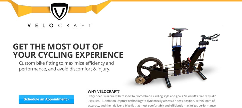
The Velocraft Cycling mobile responsive web design project was a creative design project that we really enjoyed working on. The creative direction on this mobile responsive web design project were wide open for us to explore to create a clean and compelling vision for the brand. The Logo Design was already in place and well established, so our primary goal on this project was to create the mobile responsive website design for this client.
Mobile Responsive Web Design Process
Our mobile responsive web design process for this project had few requirements in place other than following the existing logo design elements and creating a visually pleasing website with clear information about Velocraft’s products and services that was tailored for both computers and mobile browsers. After several internal design rounds exploring different creative website design concepts, we settled on a clean and open layout that pulled in custom graphics we created for the top edge of the page design behind the logo. The yellow, angular band brings in a real sense of motion and splash of color onto the mobile responsive web page design, and also helps set off the logo emblem adding depth to the page and a faux 3-d appearance on the site pages. The primary navigation utilized forward slashes as the dividers between the navigation items, which also ties in nicely with the angular band. A 12 column, grid-based layout was incorporated from the very beginning of the mobile responsive web design process, which allowed for rapid development after the mobile responsive designs were approved by the client. The web site homepage features a large rotating banner area that the client can control via the WordPress admin area and custom fields we implemented.
Desktop Size – Mobile Responsive Layout:

Mobile Responsive Web Design Benefits
 Mobile Responsive Web Design is truly becoming the “new normal” on the web, and we believe that it’s as important as search engine optimization when building new web sites for our clients. We begin our design process on every new mobile responsive web design project with a “mobile first” attitude, and this allows us to design for both desktop and mobile browsers at the very beginning of every project. More and more users are visiting websites with mobile devices and tablets, and site visitors have growing expectations that a website should work on their smartphone or tablet. Mobile responsive web design helps solve this problem by utilizing a flexible, grid-based layout that allows page content to flow in predictable ways depending on the device screen resolution.
The end result of mobile responsive web design is that the desktop browsing experience is basically the same, although we can now flexibly account for even larger screen resolutions as well, and the mobile experience is one that can be fully customized to show the content most relevant to mobile visitors. Generally speaking, this might be company phone numbers with “click-to-call” enabled for smartphone devices, or interactive maps for users to easily locate a business location within the mobile responsive design.
The full-sized desktop web design layout (shown above) is the content that will be displayed for desktop users and any device with larger screen and high enough resolution. The mobile responsive web design image (shown to the right) illustrates how the same website content flexes into the mobile responsive web design layout, and even how some content is dynamically removed from this layout once the device detection happens. Fonts stay large and readable, and there is no need for the user to have to zoom in and scroll around the full sized size on a smartphone with a tiny screen. All the content stays organized and looking great within the mobile responsive design, and there is no need for the client to maintain a separate code-base or website page within the content management system.